We have a particular color palette, specific rules about use of our logos, recommended fonts, and many other guidelines for the Lafayette brand. To maintain our brand’s strength, please adhere to the brand guidelines when using any Lafayette logo, preparing printed materials, developing digital media, or creating documents for promotional use. For review and approval of all Lafayette logo use, or if you have questions on brand guidelines, templates, fonts, or web style guidelines, contact the Communications Division.
Lafayette College Logo
 Two versions of the Lafayette College logo have been created to suit different design circumstances. The main Lafayette College logo is set on two lines. It is the most complete and should be used wherever possible.
 The alternate version, which does not include the word “College,” is useful in a variety of contexts:
- low resolution environments such as websites and html emails where readability is a concern
- busy designs where additional clarity is desired
The Lafayette College logo must appear in a prominent position on all print and electronic communications that are intended for external audiences. Examples of external audiences are: prospective students and faculty, alumni, donors, press, community groups, academic societies, community organizations, foundations, and corporations. The logo is not required on strictly internal communications, such as flyers posted on campus, club announcements, and internal departmental communications. Student groups, other than athletic clubs or teams, are not required to use the College or athletic logo although it will be made readily available to them, and they are encouraged to add it to their promotional materials.
- On a multi-page print publication: The logo should be placed on the front or back outside cover or on the inside front cover.
- On an advertisement or poster: The logo should appear on the front.
- On a website: The logo should appear on the homepage.

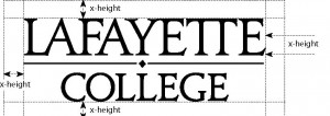
A “clear area” around the logo should be equal to the height of the lowercase letters. The xheight should be incorporated into any design using the logo. The height of the Lafayette College logo should not be less than 1/2 inch in print.
It is very important that designers or desk top publishers do not attempt to construct the logo themselves, as the lettering in the logo has been sculpted especially for Lafayette College.
- Do not reproduce the logo by scanning a previously printed version. Such “second generation” art will degrade the quality of the image and perhaps alter the scale of the various elements.
- Do not copy the logo from the Lafayette College website. Doing so will produce a poor quality image that will not reproduce clearly or accurately.
Download electronic files of the official Lafayette logo
Department Logos

To reinforce the College’s graphic identity system, the style above is he only permissable representation of a department or program with the name “Lafayette” attached.
The Communications Division will furnish logos to academic and administrative departments or programs upon request. All College logos must adhere to the standard outlined in this guide where the department or program name will replace the word “COLLEGE” in the stacked version of the primary logo.
Incorrect Uses of the Logo

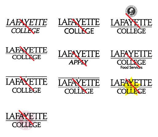
- Do not manipulate or distort the Lafayette College logo by stretching or compressing it
- Do not add words or images to the logo to create a composite logo treatment
- Do not replace an element of the logo
- Do not reposition, resize, or separate components
- Do not overlap other logos or marks
- Do not add any elements to the logo, such as a line or punctuation mark
- It is not permissible to print the logo in any two-color combination
College Seal
The Lafayette College seal has a long tradition as an element in College iconography. The official Lafayette College seal is used on formal documents, i.e., on diplomas or other official administrative communications emanating from the President’s Office or the Board of Trustees. The seal is also used for official ceremonial functions such as Commencement and appears on approved plaques, flags, or furniture.
The seal is not the school logo. It should not be used on stationery or brochures as a logo. Generally, it should be reserved for official and ceremonial functions. Offices wishing to use the seal as a design element in a brochure should contact the Communications Division.
The Athletics Brand
 Lafayette College maintains two separate identity systems: the first, which is discussed here, is used for all general College communications. The second is used for Lafayette’s athletics program – signs, sports paraphernalia, stationery, uniforms, etc. If you have any questions regarding the Athletic Communications design guide, please contact the Office of Athletic Communications & Promotions. The design guide for the athletics program can be obtained here.
Lafayette communications should employ each guide in appropriate contexts. The two should never be used together. To promote the athletics program or allude to the spirit that Lafayette derives from its sports, the athletics guide should be used. The College guide is used in all other circumstances.
Color Palette
The official Lafayette College colors are maroon and white. It is important that when the colors are used they are rendered accurately. This can pose a significant challenge, since vendors working in various media use different means for reproducing colors— for example on a delivery vehicle or banner. The ultimate reference point for the school colors is the Pantone color Matching System PMS, developed for offset printing.
Print Color Palette Specifications
PMS 202 Coated
PMS 202 Uncoated
PMS Black
Lafayette College Maroon
PMS 202 (Coated)
CMYK = C10 M97 Y61 K48
RGB = R130 G36 B51
HEX = 822433
Lafayette College Maroon
PMS 202 (Uncoated)
CMYK = C12 M88 Y67 K34
RGB = R139 G83 B93
HEX = 8B535D
Lafayette College Black
PMS Black
(Coated & Uncoated)
CMYK = C63 M52 Y51 K100
Website Color Palette Specifications
#65001C
#910029
#1D5F83
#4EA8D8
#A2998B
#E8E6E2
Official Lafayette College Typefonts
There are specific typefaces Lafayette College departments are required to use on all electronic and print publications.
The typefaces have been selected to allow for flexibility of design while also complementing the College logo. The goal is to allow departments to create a distinctive “look” that suits their marketing purposes while also ensuring that all communications from Lafayette College bear a family resemblance. Each family of fonts has a large range of weights and style choices, including italics, bold, etc. to allow for numerous options.
Serif Typeface
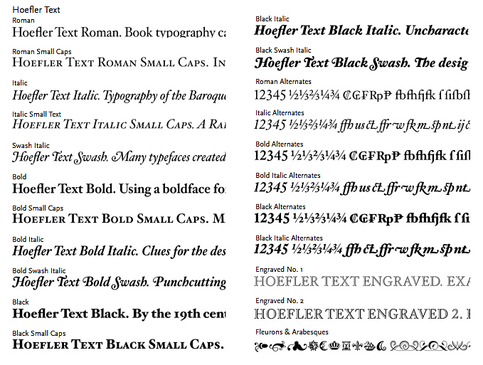
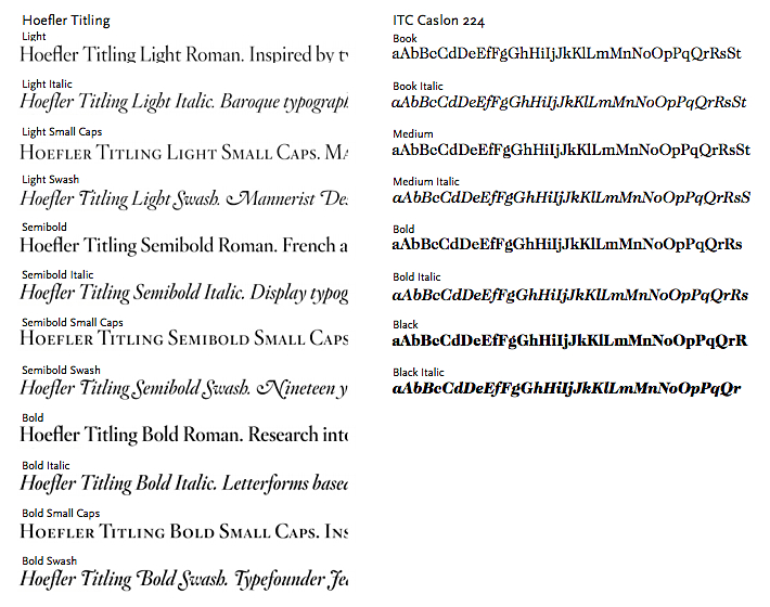
In most circumstances, offices that are preparing brochures or other publications will rely most heavily on the serif typeface.* The serif typefaces that have been selected for all Lafayette College print communications are Hoefler Text and Titling and ITC Caslon 224.
Hoefler is an unusually complete family of typefaces. It offers full families of fonts in both text and titling formats, including Roman, bold, black, italic, and smallcaps. Also included are special font sets swash, alternates, engraved, and flourishes. Hoefler can be used for both headlines and body copy.


Note: ITC Caslon 224 is a stylized serif font that is used for headlines only.
Sans Serif Typeface
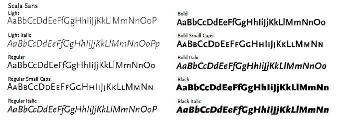
The sans serif typeface used in Lafayette College publications is Scala Sans. Scala Sans is in the humanist tradition of sans serif typefaces, avoiding the geometrical and industrial feel of earlier sans serif designs. Its letter forms feature a good deal of sculpting and variation in width. This makes it suitable for a wide range of applications. It is unusually readable for a sans serif typeface. It is possible to design a whole brochure, including body copy in Scala Sans. When used large in headlines, the typeface has a modern, refined appearance that compliments the Lafayette logo.

Web Type Fonts
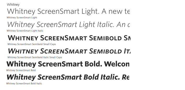
Whitney is the family of sans serif digital typefaces chosen for the College’s web presence. Its compact and flexible forms uses space efficiently, and its open shapes make it clear under any circumstances.

Heading and Table Styles
Headings
h1 – The five boxing wizards jump quickly.
h2 – The five boxing wizards jump quickly.
h3 – The five boxing wizards jump quickly.
h4 – The five boxing wizards jump quickly.
h5 – The five boxing wizards jump quickly.
h6 – The five boxing wizards jump quickly.
Table
| Heading 1 |
Heading 2 |
Heading 3 |
| Col Text |
Col Text |
Col Text |
| Col Text |
Col Text |
Col Text |
| Col Text |
Col Text |
Col Text |
To show a block quote with the author of the quote attributed, use “templates” from the content editing window.
Button link
