Web Style and Component Library
Your website is the most important marketing and information channel for our primary audiences. As such, your website plays an important role in advancing and supporting the Lafayette College brand.
The Hermione theme features five page content sections, including:
- Department Page Content
- Page Content
- In-Content Callouts
- Sidebar Callouts
- Full Width Callouts
Each section offers a number of different components to display and highlight information and media.
Department Page Content
The Department Page Content section is where to upload a header image for your page. It offers an option to display a short header.
Page Content
Page Content section contains the title, intro, and content fields. Content added in this section will display at the top of the page and before all other content added to the ‘In-Content Callouts’, ‘Sidebar Callouts’, and ‘Full Width Callouts.’ Add content by filling in each block.
In-Content Callouts
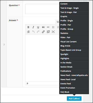 In-Content Callouts contain the majority of page components. To chose a component for your page, simply click on the blue “Add Content” button at the bottom of the In-Content Callouts section and pick a callout type from the pop-up menu. Each callout consists of multiple fields that you will fill in with your information and images. Most callouts allow a choice of color themes.
Sidebar Callouts
Sidebar Callouts are reserved for flexible buttons and a button that links to the campus calendar.
Full Width Callouts
The Full Width Callouts section contains components that will appear at the very bottom of the page. They fill the full width of the browser window and contain blocks to input information such as announcements, galleries, and contact info, among others. Click on the blue “Add Content” button on the bottom of the section to access a pop-up menu to pick a callout type.
Tips for Using the Page Content Sections
- Any field with an * next to it is a required field.
- Image blocks have a minimum size indicated next to the image block. Any image smaller than the minimum size will result in an error message in the media library.
- You may create a WordPress gallery on your page by using the “content” component in the pop-up menu. Be aware that the images for a gallery need to be 770 x 433px in order to fill the space correctly.
Images
Images are a important part of your website design in some areas. At the highest level, images help your visitors connect and feel comfortable on your site. You want to capitalize on the amount of information presented in a photograph.
Depending on the Callout being displayed, one of the following sizes will used:
- 1440×810
- 770×433
- 470×300
- 160×160
When adding images to callouts, the best strategy is to create an image at the highest size because When you add an image to your site it will create a version of that image at each of the above sizes. This leaves you the option of using the image in multiple places if needed and not have to worry about not having the right size or end up with something with poor resolution. For the most part you will be dealing with an aspect ration of 16:9. There are a few callouts that use an aspect ratio of 1:1, but if your image has it’s content centrally positioned, it will crop properly. You may also refer to examples below to see the minimum image size required for each callout.
Some basic guidelines to follow when creating or choosing images to use on your site:
- Aspect ratio of 16:9
- 72 dpi
- JPEG, PNG, and GIF are the most popular file formats for images.
- They play different roles.
- A relatively high-quality JPEG could have a file size at a fraction of a PNG and can deliver comparable quality.
- Image should have strong CENTRAL positioning.
Cropping Images
Our site is responsive, the images will scale in size depending on the device it is being viewed on. However, it is not perfect, so playing with image placement helps, you want your image to have strong central positioning after cropping.
If you don’t have Photoshop, optimize images with https://pixlr.com/ – a free photo editing and design tools
Other tools compress and optimize images
For consultation on manipulating images, contact the Communications Division or visit web.lafayette.edu.
In-Content Callouts
There are 22 different In-Content Callouts. They are shown below as they will appear in your browser. The Lafayette Web Style Guide PDF illustrates the WordPress admin area for each component.
Text & Image Single
Heading LinkMinimum image size: 770px x 433px
Text & Image - Pair
Heading LinkMinimum image size: 770px x 433px
Label
Graphic
Minimum image size: 770px x 433px
Profile Single
Heading LinkMinimum image size: 770px x 433px
Profile-Pair
Intro paragraph goes here, but is not necessary.
Minimum image size: 770px x 433px
Profile Group
Heading LinkMinimum image size: 160px x 160px
Statistics
Heading Link

Minimum image size: 470px x 540px
Video - Pair
Heading LinkMinimum image size: 770px x 433px
Highlights
Spotlight
Vivamus ullamcorper cursus mi, vitae malesuada nulla consectetur in. Aliquam erat volutpat. Pellentesque a erat eros. Etiam at turpis nec lectus dictum rhoncus.
Minimum image size: 770px x 433px
Highlights
- Suspendisse pellentesque varius interdum. Nulla convallis diam libero, a suscipit metus accumsan vitae. Aliquam et mollis diam. Proin ac ultricies neque.
- Curabitur ut eros in mauris porttitor laoreet. Duis a molestie nunc.
- Quisque nec elit leo. Maecenas facilisis dolor non luctus molestie.
In the Media
Visual List Content Group
Overall Description goes here.

Title
Lorem ipsum dolor sit amet, consectetur adipiscing elit. Cras faucibus placerat eros ut finibus. Curabitur porta, nisi a elementum viverra, arcu tellus finibus velit, vel lacinia mi lacus a justo. Maecenas vitae quam urna. Nulla eu consectetur mauris. Ut ex nibh, varius nec nisl at, fringilla placerat leo. Nulla nec efficitur diam, vitae semper nis
Link Text
Title
Lorem ipsum dolor sit amet, consectetur adipiscing elit. Cras faucibus placerat eros ut finibus. Curabitur porta, nisi a elementum viverra, arcu tellus finibus velit, vel lacinia mi lacus a justo. Maecenas vitae quam urna. Nulla eu consectetur mauris. Ut ex nibh, varius nec nisl at, fringilla placerat leo. Nulla nec efficitur diam, vitae semper nis
Title LinkMinimum image size: 470px x 300px
Topic Based Link Group
Heading Link
Description goes here.
Minimum image size: 770px x 433px
Section Break
Heading Link TextStay Connected
From news.lafayette.edu
All Recent News
Feb 27, 2026
Author, Harvard professor Arthur C. Brooks to deliver keynote speech at Lafayette’s 191st Commencement
One of the world’s leading experts on happiness, Brooks travels the world to teach others how to build a fulfilling life
Feb 23, 2026
Lafayette once again named a top producer of Fulbright students
Five seniors named grantees for 2025-26 as Fulbright program helps set them on a path toward fulfilling their career goals
Jan 30, 2026
Four students set to study abroad on Gilman scholarships
Lafayette’s Study Abroad Office helps students see the advantages of studying abroad, assists in applying for scholarships
Stay Connected
More From In the Media
Oct 15, 2018
New CEO Activism In Full Swing
NPR Chip Bergh ’79: employees want to know where their leaders stand
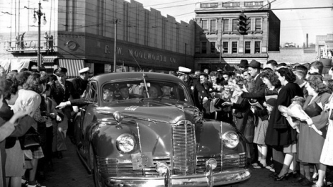
Oct 15, 2018
Photos: President Eisenhower at Lafayette
EXPRESS TIMES He is among presidents, candidates to visit Lehigh Valley

Oct 14, 2018
At the Williams Center: Steve Coleman
MORNING CALL Saxophonist is MacArthur, Guggenheim honoree
Upcoming Events
All Upcoming EventsMinimum image size: 770px x 433px
FAQ Block
Quisque nec elit leo. Maecenas facilisis dolor non luctus molestie?
Aliquam erat volutpat. Fusce vulputate dui enim, eget volutpat orci eleifend eget. Nulla id vulputate sem. Sed sit amet felis in sapien pulvinar vulputate. Curabitur ut eros in mauris porttitor laoreet. Duis a molestie nunc.
Sed interdum non risus eget sodales?
Vestibulum quis ullamcorper risus, eu fermentum est. Vivamus ac accumsan magna. Curabitur sed arcu nisi. Sed ut ultrices sapien, sit amet porta dui.
Quisque risus diam, pulvinar ac vestibulum ut, gravida at magna?
Pellentesque blandit ipsum elit, quis pretium nisi venenatis ac. Nulla facilisi. Sed eget ornare lacus. Curabitur pulvinar tristique bibendum. Maecenas pharetra, velit ac imperdiet laoreet, turpis erat volutpat orci, id consectetur augue magna tristique nibh.
Full Width Callouts
There are 8 Full Width Callouts. They are shown below as they will appear in your browser. View this PDF if you’d like to take a look at the WordPress admin area of each component.
Minimum image size: 770px x 433px
Update
Announcement content will go here.
Contact Information
Our Team
Title
Description will go here.
Minimum image size: 770px x 433px
